However, more often than not, due to the lack of the necessary funding, time, or creativity, these small businesses sometimes tend to create some very mediocre sites that can distort and take away from their brand. Consequently, it is crucial that entrepreneurs are careful and pay close attention to the design of their websites since it is one of their most important pieces of real estate on the Internet. Below are some of the most common mistakes that small business make when designing their websites and these should be avoided at all cost.
Poor Content Layout
Generally, people visit websites for the content. But many times, they will just scan through the content and rarely read everything. That’s why it’s so important for your content to be properly organized with proper page titles. Also, update your website regularly to ensure the content is current.
Poor Navigation
Nothing is more frustrating than being on a website and trying to find a bit of information but because its navigation is poor it seems as if getting anywhere is impossible. People need to be able to get around websites easily to find what they are looking for because if they cannot find what they want easily, they will just move on.
Different Interface Designs
Some web designers tend to create different designs for each webpage. This kind of confusion should be avoided. Websites should use a standard template and be kept simple and user friendly. If visitors think the site is too confusing they will most likely leave without properly exploring the content.
Excessive Use of Images
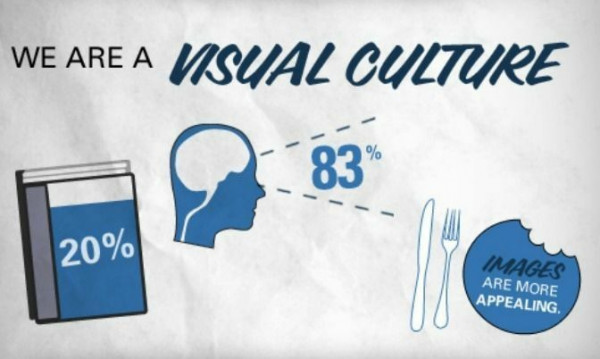
Having too many pictures is another grave mistake that web designers make. Entrepreneurs need to ensure that their websites have just the right amount of images to keep people on the site. Similarly, the use of background music is another component that should be avoided. Studies show that over 90% of website visitors to do not care about background music.
Complex Registration Forms
When asking users for information on a website via a web form, it is important that the forms are kept as simple as possible. Forms should seek to obtain the basic information. Generally, when people come to your website, they come to get information not give information.
Dead Links
Dead links are links on the Internet that direct users to webpages or servers that are permanently inaccessible. Such a situation can be very annoying to users. Make sure you remove all the dead links ever so often to better optimize your website.
Not Optimizing For Mobile
The use of mobile devices has been on the increase over the years and today a large amount of users access the Internet from their mobile devices. Ensure that your website is optimized to show on mobile devices or you can be losing out big. Google announced that on April 21st 2015, they will be making some major changed to search engine ranking. If your website is not optimized for mobile viewing it will affect your ability to show up in organic searches.
Not Having A Contact Us Page
This one is obvious! A contact page is very important for a website. It can help users feel a part of the brand, it can direct users to the necessary contact person and can be useful to get more information about the site, or for visitors to provide their feedback.
Poor Readability
Website designers and website owners need to ensure that people can read the content on the websites. Therefore, they need to ensure that the correct font is used, and it is important that the paragraphs are not too extensive. If people are unable to read what is on the site or the information is unnecessarily wordy, it totally defeats the purpose, and it is likely that they would not remain on the webpage.
Blending Advertising in Content
This is crucial, and everyone should pay close attention to this common mistake. While some businesses and websites make money from selling advertising spots on their websites, it is essential to be cautious when weaving advertisements into content. Such a practice may upset the visitors and cause them to leave the site.


